Shelby Temple5 Unusual Alternatives to Pie ChartsBefore you cook up another pie, consider these alternativesNov 4, 201820Nov 4, 201820
Yuki[Beyond ChatGPT?] 10 Insane Interactive Dashboards Created by ClaudeDiscover 10 incredible examples of interactive dashboards created by Claude, transforming data from earnings reports, research papers, and…Jul 4, 20244Jul 4, 20244
Add TwoRULE 38: NO UNNECESSARY LINES ON LINE CHARTSIn this blog series, we look at 99 common data viz rules and why it’s usually OK to break them. Here are all the rules so far.Jan 5, 20241Jan 5, 20241
InData Storytelling CornerbyJohn Loewen, PhDThe Art of Data Science: Crafting Better Data VisualsAffordances, accessibility, and aesthetics in data visual designApr 22, 20245Apr 22, 20245
InDataDrivenInvestorbyGencay I.5 Data Projects with Source Codes That Will Take You Another LevelData Projects that will get you thereApr 24, 2024Apr 24, 2024
Luna (Van) DoanWhat visualization works for your analysis purpose?Visualization? Who doesn’t create at least one Excel chart from undergrad, huh? Yet, when considering user experience and data…Mar 23, 20221Mar 23, 20221
Luna (Van) DoanThis is Exactly How I Use SQL at Work as a Data ScientistAnd why you should learn SQL to level up your data career.Apr 30, 202417Apr 30, 202417
InTowards AIbyGencay I.7 Pandas Hacks That Every AI Expert Should KnowUnlock AI & Data Science Mastery with Top Pandas HacksApr 3, 20241Apr 3, 20241
InBootcampbyDr Ziwei WangThe Practical Way to Take Notes in Miro WhiteboardClick Path notes are important because it help us discover users’ task flows or page flows. This can help us design more smooth experience.Apr 1, 2024Apr 1, 2024
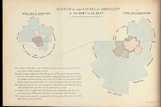
InStartup StashbyDan StevensData Visualisation Makes Great Content. So Why Is Most Of It So Bad?Florence Nightingale’s infographics were better than most of today’sJan 10, 202412Jan 10, 202412
InLevel Up CodingbyYeyu HuangAmazing! I Created My Own Image-Based Chatbot Powered By ChatGPT API + AzureA step-by-step guide to integrate MM-REACT into your AI Chatbot websiteApr 4, 20234Apr 4, 20234
InDataDrivenInvestorbyGencay I.Pandas groupby() : Best Swiss Knives That All Data Scientist Should Have!Discover the ultimate tool for data manipulation: Pandas groupby()Mar 28, 2024Mar 28, 2024
InDataDrivenInvestorbyRavi | Python ✍️Mastering Advanced Python: 40 Pro-Level Snippets for 2024Unlock the Power of Python’s Latest Features with 40 code snippetsFeb 14, 20241Feb 14, 20241
InThe EconomistbyRosamund PearceWhy you sometimes need to break the rules in data vizBest practices help us to avoid common pitfalls in data visualisation — but we shouldn’t follow them blindlyFeb 28, 202012Feb 28, 202012
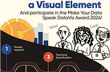
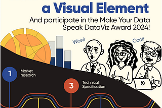
InMake Your Data SpeakbyAlex KolokolovHow to Create a Visual Element for Power BI?And participate in the Make Your Data Speak DataViz Award!Jan 22, 2024Jan 22, 2024
InMake Your Data SpeakbyAlex KolokolovWhy chart-choosers don’t help, and what is a dataviz compass?How to choose the right chart without breaking your brain?Jul 12, 2023Jul 12, 2023
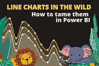
InMake Your Data SpeakbyAlex KolokolovLine Charts in the WildHow to Tame Them in Power BIJan 29, 2024Jan 29, 2024
InMake Your Data SpeakbyAlex KolokolovVisualizing Knowledge: Essential Books for Business Intelligence EnthusiastsFrom Deceptive Statistics to Impactful PresentationsDec 1, 2023Dec 1, 2023


![[Beyond ChatGPT?] 10 Insane Interactive Dashboards Created by Claude](https://miro.medium.com/v2/resize:fill:160:106/1*mQxRWz9TdViiVU-dc3RTnQ.png)
![[Beyond ChatGPT?] 10 Insane Interactive Dashboards Created by Claude](https://miro.medium.com/v2/resize:fill:320:214/1*mQxRWz9TdViiVU-dc3RTnQ.png)